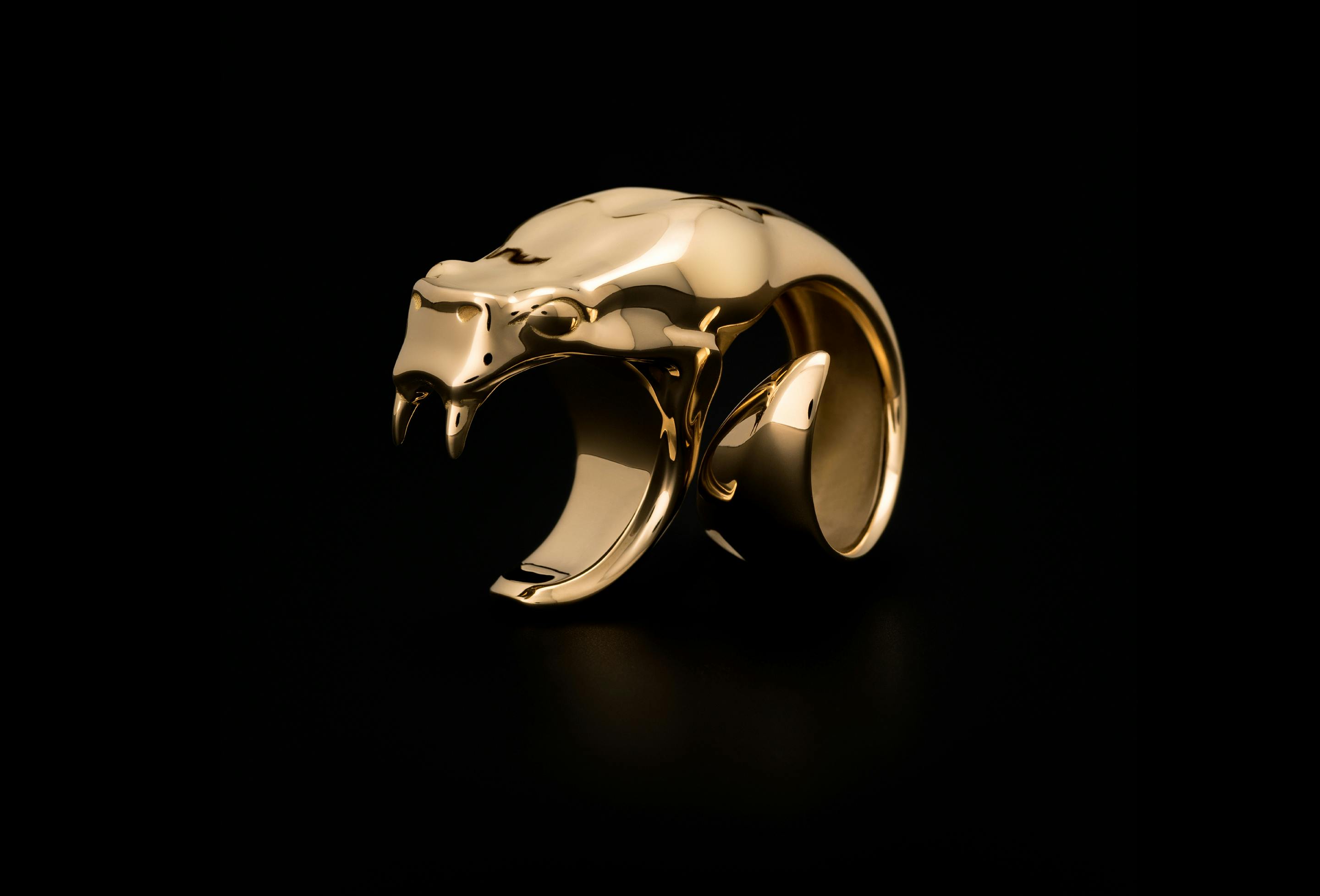
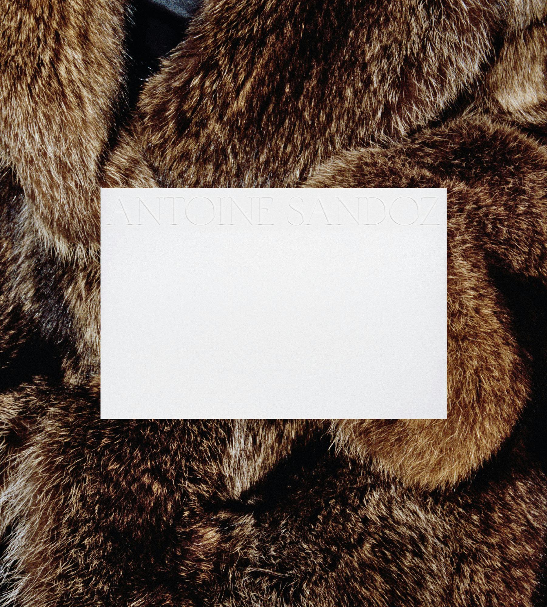
ANTOINE SANDOZ LONDON is a fine jewellery brand that balances a striking aesthetics with unexpected creative references that challenge preconceptions of beauty. BRITISH STANDARD TYPE were commissioned to produce logotypes and a display serif typeface that would inform the visual identity of the brand and smooth its entry into the luxury markets.

Influenced by lettering found in ancient Roman engravings, sharp details and subtle idiosyncrasies are foregrounded in geometric and contrasting proportions that supply an unusual rhythm. High crossbars and bottom-heavy counters create asymmetry and additional character. Used confidently across communications the typeface was drawn to be applied at large sizes to establish an authoritative and graphically ordered brand identity with a timeless and modern aesthetic.
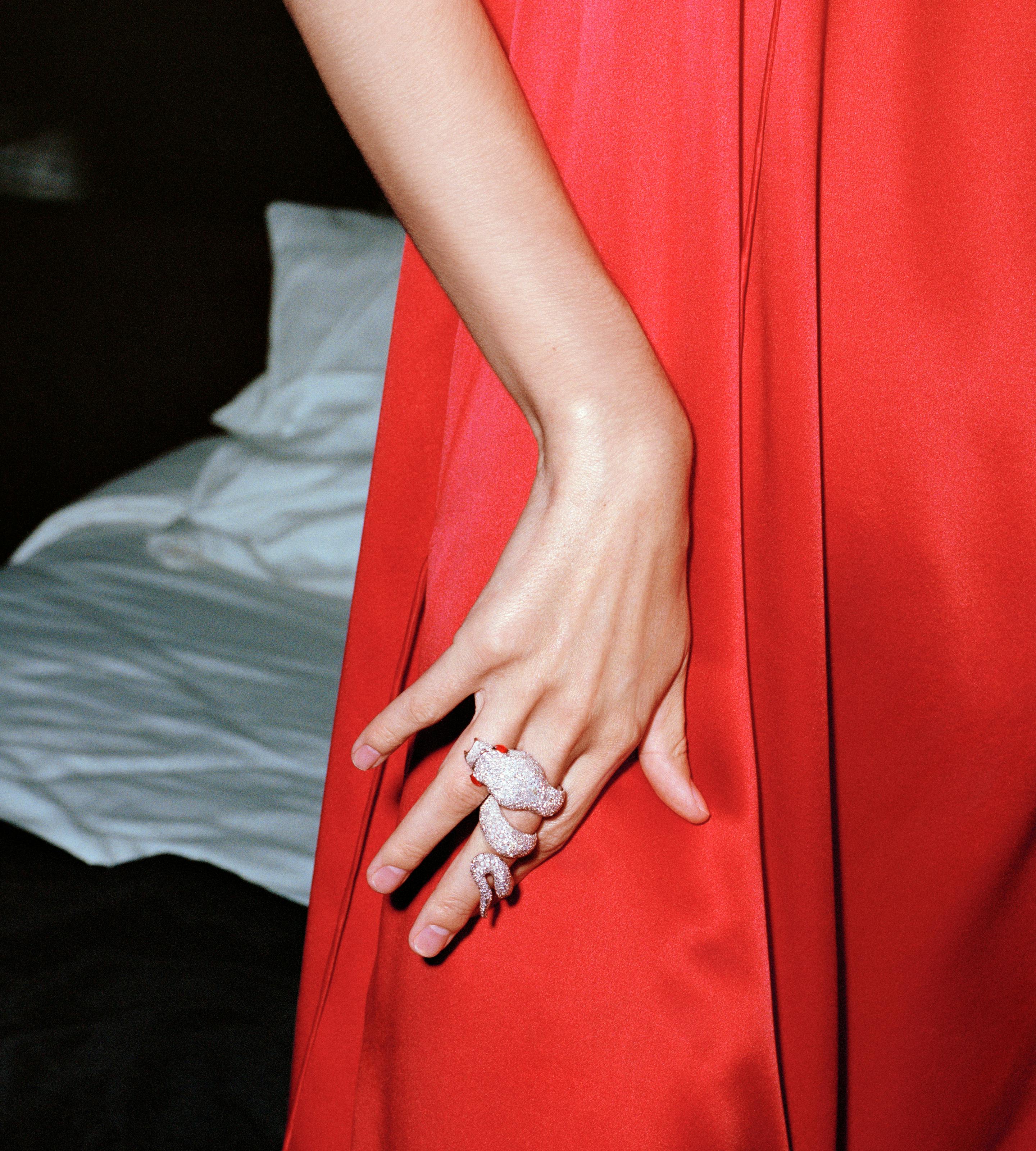
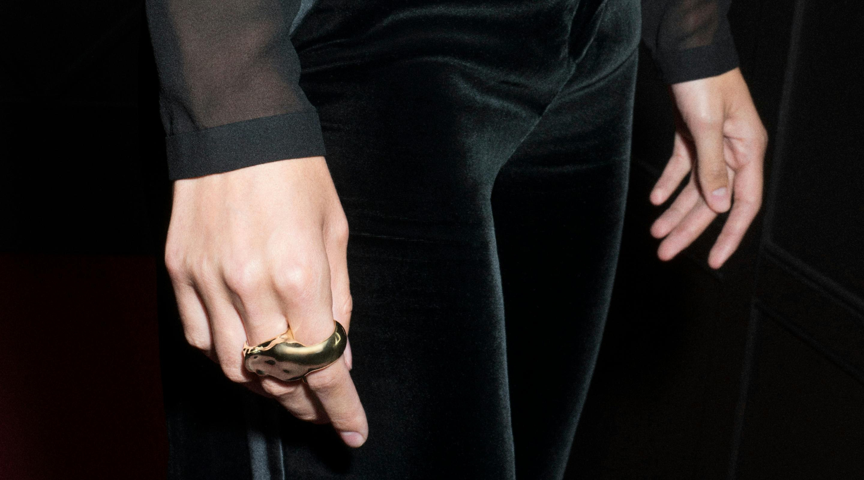


Stamped into each item of jewellery and used across digital, print and packaging communications, the typeface provides an elegant language that encapsulates Antoine’s creative identity and carefully balances tradition with a progressive aesthetic.


Typeface: ASL Display
Additional: Logotype & Iconography
Commissioner: Antoine Sandoz London
1 Style: Regular Display
Coverage: Latin-A Encoded
Classification: Serif
Photography by Chris Rhodes, Styling by Lyson Marchessault, Art direction by Spencer Fenton

